
Turn the numbers into
a sequence people understand.
Build editable charts, KPI narratives and summary images, then fill them from reporting data for each period or customer.
Lead with the decision.
Let the data support it.
JsonCut data stories combine structured inputs with ordinary visual layers, chart motion and reusable scenes.
Lead with the decision
Organize the report around the insight rather than animating every available number.
Keep charts editable
Build visual bars, counters and annotations as normal project elements.
Repeat the format
Fill dates, metrics, labels and highlights from a typed template.
A clear path from
source to output.
Build editable charts, KPI narratives and summary images, then fill them from reporting data for each period or customer.
- 01
Choose the insight
Decide which change or result the audience should understand.
- 02
Build the narrative
Combine editable charts, counters, labels and context in clear scenes.
- 03
Repeat the report
Fill period, customer and metric inputs while the approved structure stays intact.
Concrete work.
Not generic promises.
See finished work.
Inspect the project behind it.
Hand-picked image and video projects that demonstrate the data & report video workflow with editable source.
Explore all examples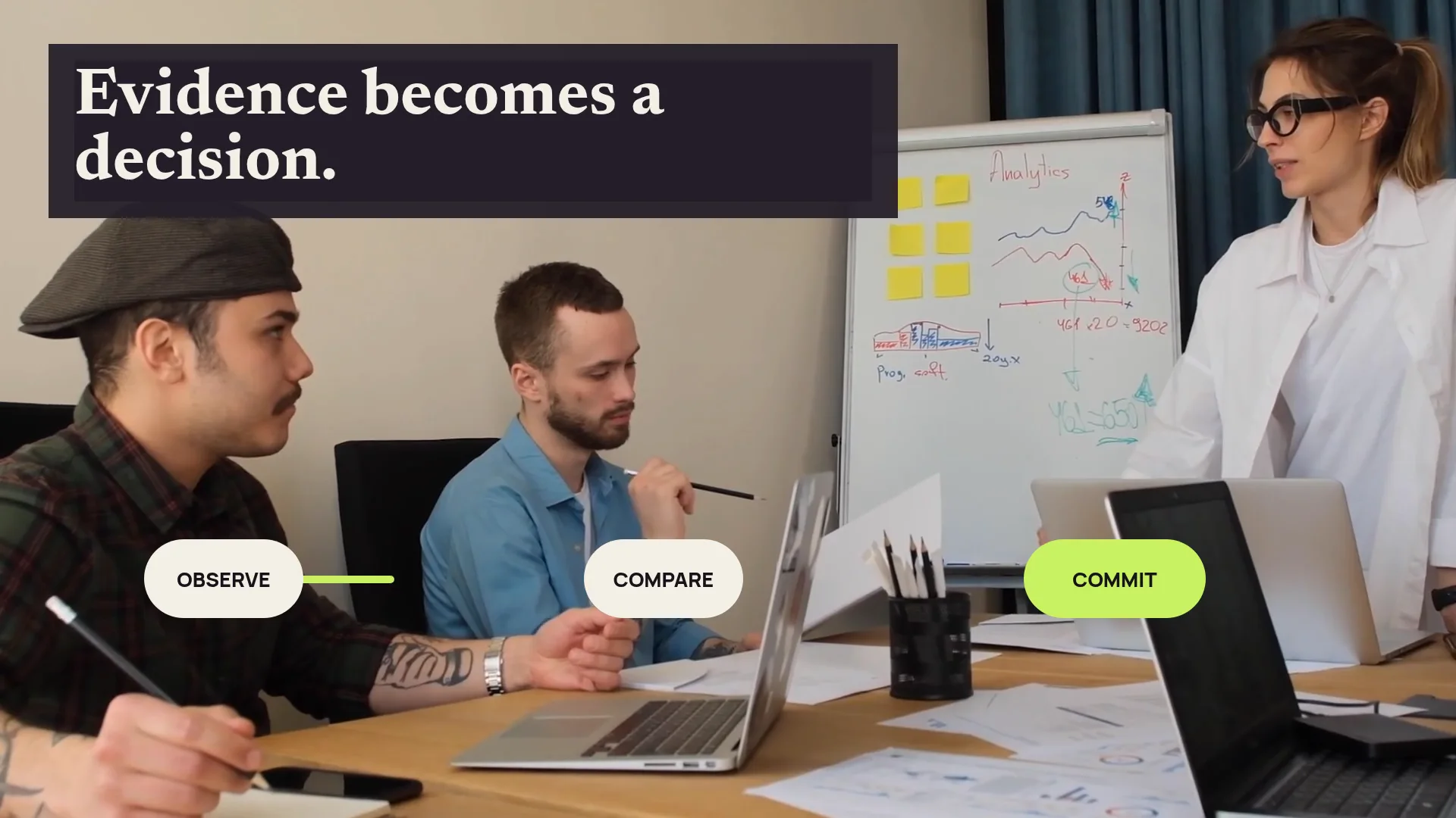 01 · Video
Quiet business footage gains anchored KPI overlays, measured connectors and a concise evidence-led resolution.
View project 02 · Video
A detailed invoice moves through extraction, approval, payment and audit trail without flattening the document workflow.
View project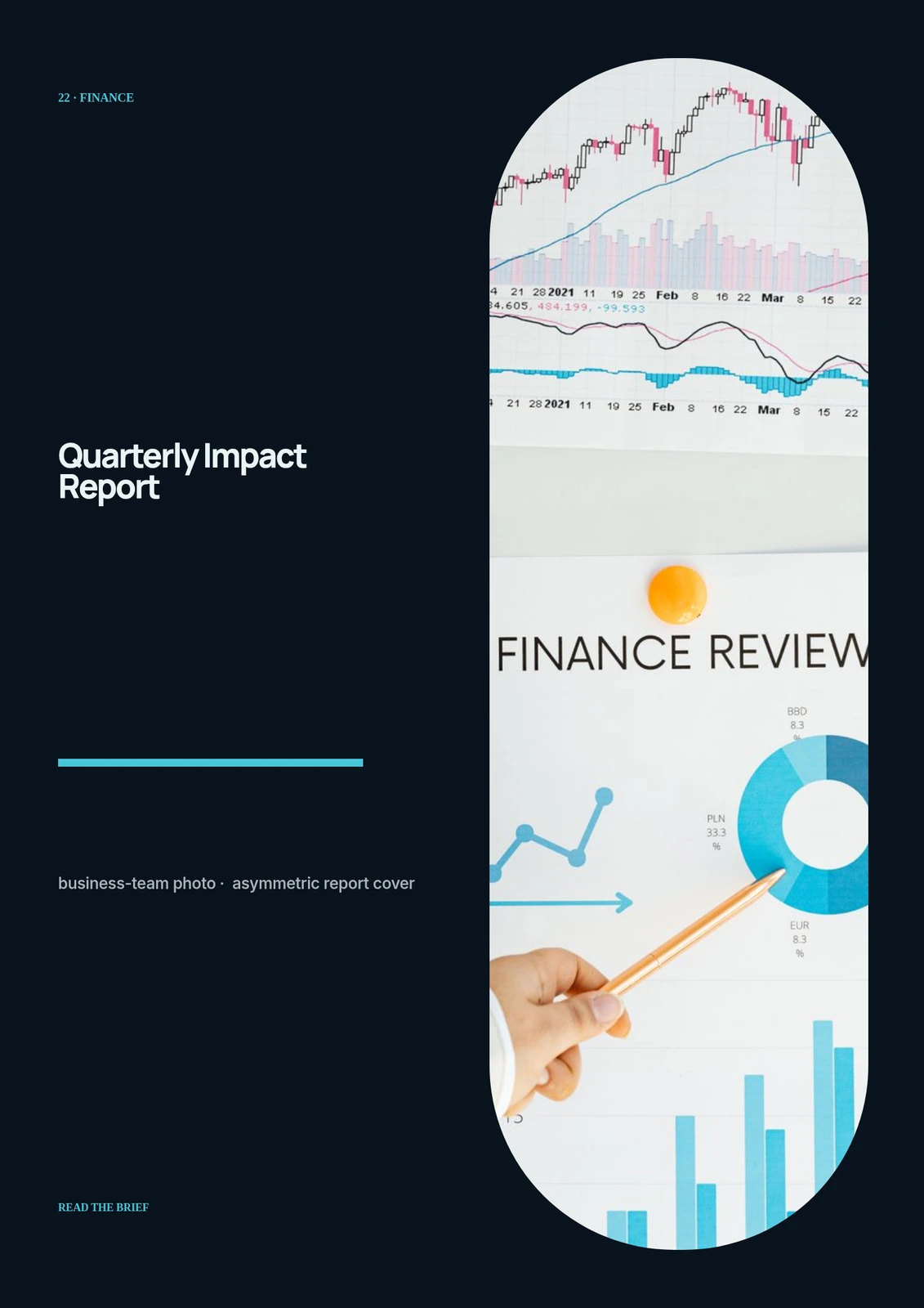 03 · Image
Original business-team photo, asymmetric report cover, indexed chapter marks and foil-like metric numerals.
View projectBuild the first result.
Keep the next one easier.
Start with a complete image or video project. Add templates, automation or an Agent where they remove repeated work.
Open JsonCut Studio